How “Spider-Man: Into the Spider-Verse” is so unique
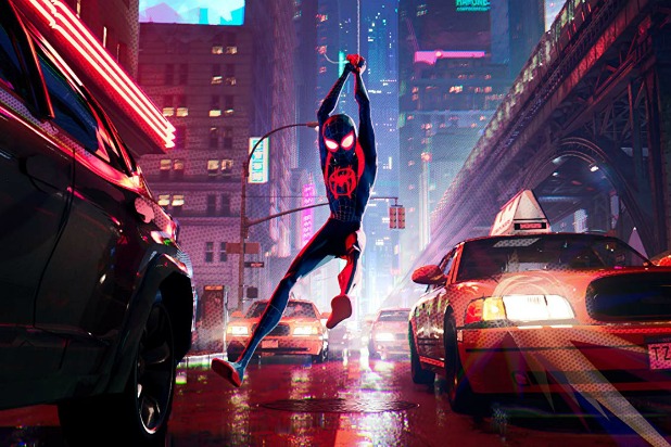
Photo Courtesy of Sony Pictures Animation
February 4, 2019
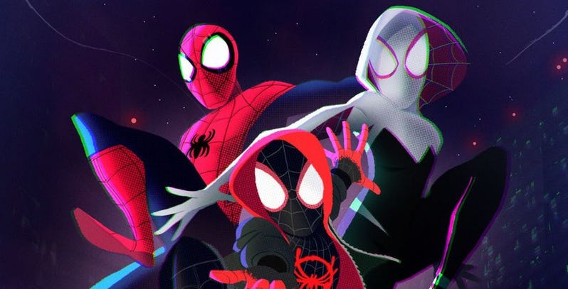
Spider-Man: Into the Spider-Verse has flipped Hollywood’s animation scene upside down. With bombastic color, unique animation, and beautiful effects, it has developed a style that is completely its own. But there’s a lot of work that went into it that many people wouldn’t recognize if not informed. (Might delete)
Into the Spider-Verse has been almost universally loved by critics and audiences alike, maintaining a 97% with critics and 94% with viewers on Rotten Tomatoes. It’s been a favorite of award season as well, with plenty of wins and even more nominations. But outsiders are wondering: what’s so great about it? It’s just a kid’s movie, right?
Well, aside from the wonderful story, dialogue, acting, direction, and generally anything else that could make a movie good, the animation is the most refreshing thing general audiences have experienced in years, maybe even decades. How’d they do it? They broke the rules, and made a few of their own.
According to Patrick O’Keefe, one of the film’s two art directors, it was all about basic principles: Appreciation of the printed comic book form itself, the graphic simplification of animation, and admiration of live action cinematography. This meant that the team had to innovate, as an animated film has never been done in this exact style before.
One of the film’s directors, Bob Persichetti, explained how the team translated the visual “feel” of comic books into 3D during an interview with The Verge: “All our animation is on twos… If you wanted something to feel smoother, you’d put it on ones. The existing computer-animation process reads everything on ones,” one of the many ways the Spider-verse team applied physical, hand-drawn animation techniques to three-dimensional animation.
The movie also has an extremely unique color palette. It manages to exaggerate everything that needs to be noticed while keeping the background interesting. Interviews illustrate how much work went into the process of pushing every scene to its limit, while keeping it focused and clear: “… it’s an action film. We want to break new ground on that as well. We can’t do it at the cost of engagement with the characters. It’s a fine balance.”
Of course, mashing two supposedly incompatible art styles and their techniques come with their own problems. As O’Keefe describes, “There was a set or two that we designed that definitely broke,” and Persichetti reflects on how, ” I got to meet all these wonderful people who wrote code that saved the movie.” Luckily, it seems as though the troubles were worth it.
So worth it, in fact, that Sony has filed a patent for the art style. Animators shouldn’t worry too much, though: the information is relatively slim on how far Sony is going with the patent, and it’s expected it’ll be used to make more films in the Spider-Verse. Either way, hopefully other studios will be inspired to blow us away even further with their own styles.
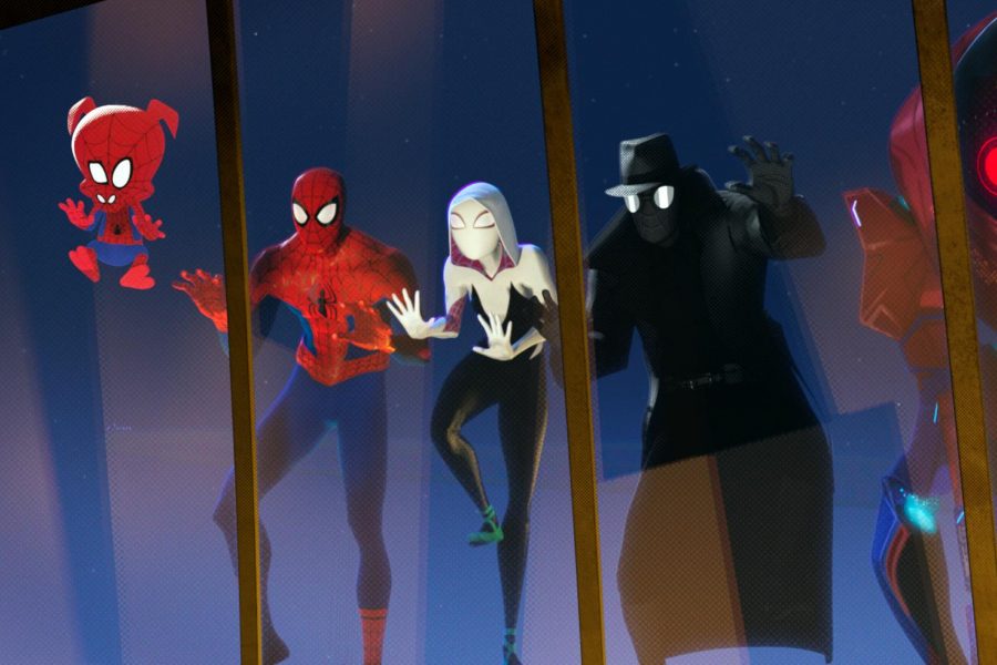
The movie also has plenty of little bonuses for comic fans: from alignment “flaws” (the “old-3D” effect seen throughout the film) which are actually a callback to printing mistakes made in old comics, to memes. It’s clear this film was a labor of love by everyone involved, dedicated to the wonderful world of comic books.
So even if you’re (somehow) not a fan of Spider-Man, if you have any interest in cinema or animation, this movie is a list-topper. Check out the trailer, and pay attention to the characters as well as the detail work through the rest of the frames. It’s amazingly unique.